GoAccess Design System
Tokens, not opinions.
The marks, colours, type and controls that make up GoAccess — from the guardhouse kiosk to the resident app to a printed proposal. If it is not on this page, it is not part of the system.
01
Logo
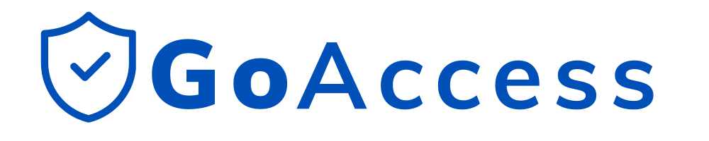
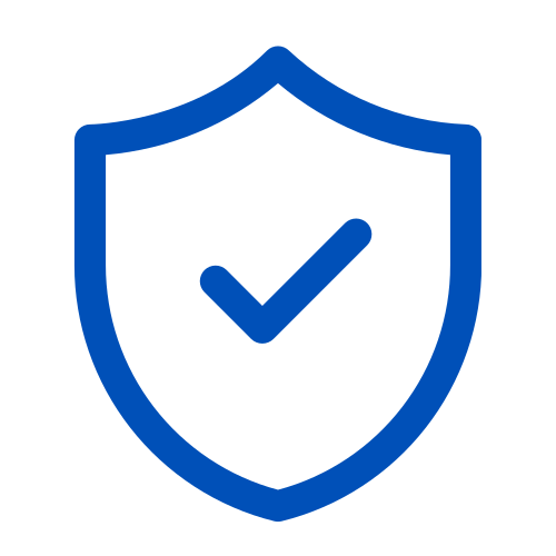
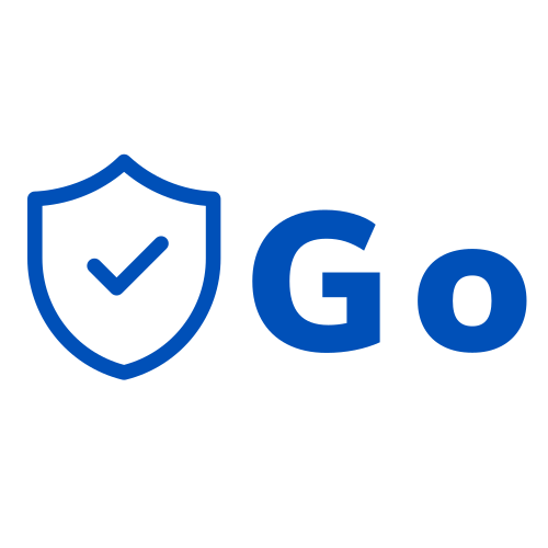
Four marks: the horizontal lockup, the shield on its own, a compact shield-plus-Go lockup, and the square app icon. Each lockup has a color and a white variant. Color on light surfaces, white on brand blue or foreground. Nothing else — no recoloring, no effects, no rotation.




02
Color
One blue carries the brand; the greys are warm and stay in the background. Reach for the named token rather than a loose hex, so a change lands everywhere at once. Hex values are given for print and proposal work.
Brand
Status
Surfaces
Lines & focus
Brand blue ramp
10020030040050060003
Typography
Roboto sets everything. Weight and size carry the hierarchy — there is no second display face. Roboto Mono is reserved for machine output: plates, codes, coordinates, timestamps.
04
Radius & spacing
Six radii and an eight-step spacing scale. Controls are 8px, surfaces 12px and up. Nothing in between gets invented.
Radius
small · 6pxcontrol · 8pxsurface · 12pxlarge-surface · 16pxextra-large-surface · 20pxfunctional-circle · 9999pxSpacing
1 · 4px2 · 8px3 · 12px4 · 16px6 · 24px8 · 32px12 · 48px18 · 72px05
Controls
Buttons and inputs are both 44px tall with an 8px radius, set in body type. One primary action per view. Red is reserved for destructive actions that require confirmation.
06
Icons
Stroke only. 1.75px weight, rounded caps and joins, on a 24×24 grid. No filled or decorative icon sets.